AGC平台:
**华为AGC(AppGallery Connect)**是华为为开发者提供的一站式应用开发与运营服务平台,主要服务于华为生态(如HMS移动应用、HarmonyOS应用等)。
主要用途:华为应用上架,开通华为服务
- 快速开发:提供开发工具、API和SDK,降低开发门槛。
- 应用上架:支持应用发布到华为应用市场(AppGallery)。
- 运营增长:助力开发者提升应用活跃度、用户留存和变现能力。
利用AGC平台创建项目(对内)+应用(对外,供别人进行下载)
应用包名(利用驼峰命名法,确保唯一性):com.公司域名.hm(此处是鸿蒙应用,如果是安卓可改为az)_**(应用名)
一、一多定义
“一次开发、多端部署”简称“一多”:一套代码工程,一次开发上架,多端按需部署。
为了实现这个目标,主要解决 3 个核心问题:
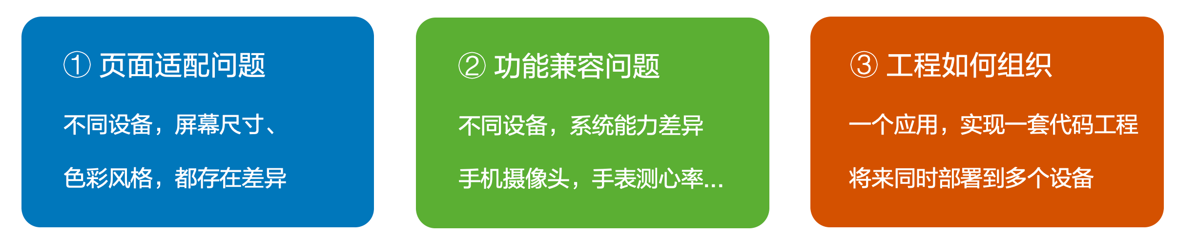
- 页面适配问题:界面级一多 - ArkUI(响应式布局/自适应布局)
- 功能兼容问题:功能级一多
- 工程如何组织:工程级一多 - 模块化按需部署(三层架构)
二、界面级一多能力
此处主要解决的是1.界面适配问题
界面级一多能力有 2 类:
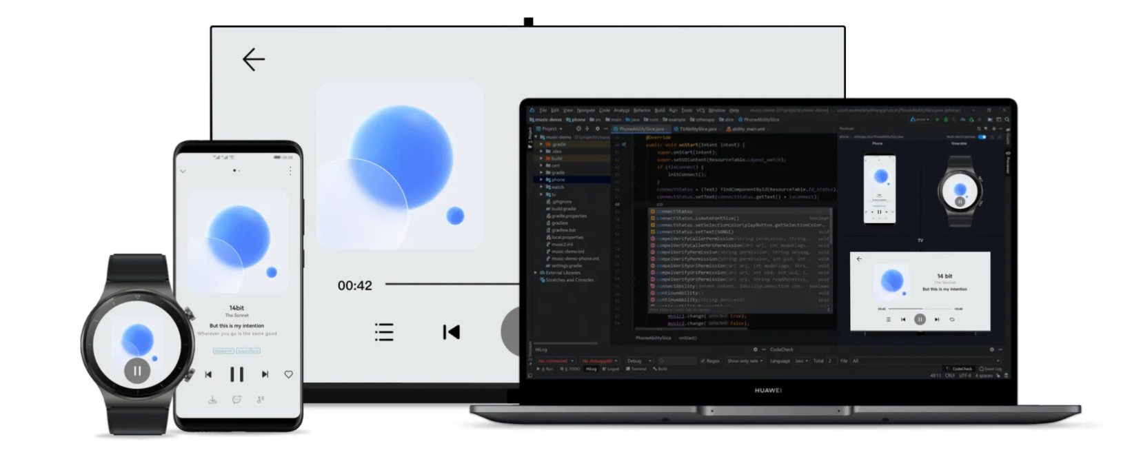
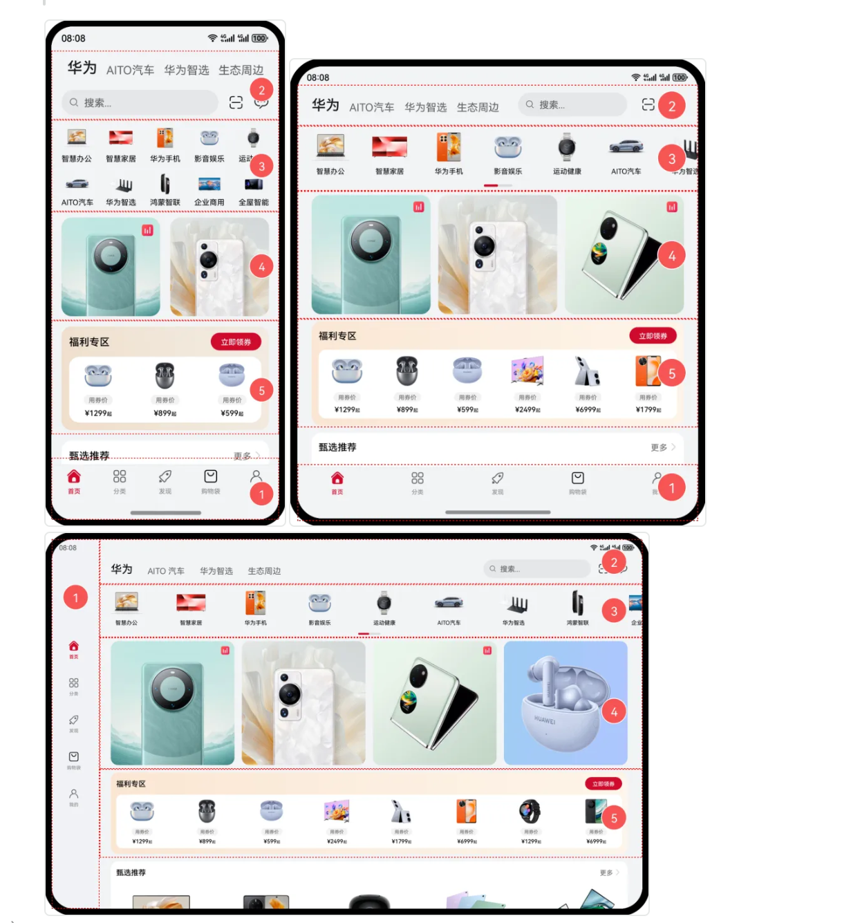
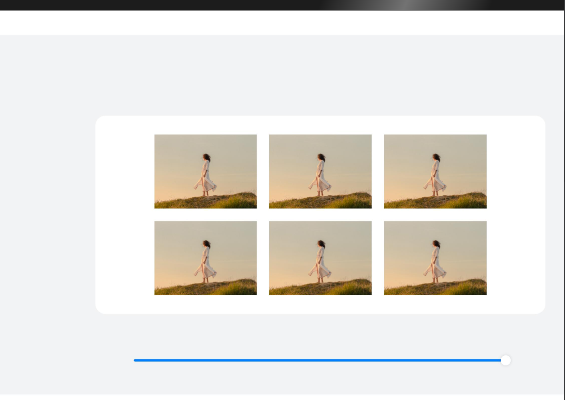
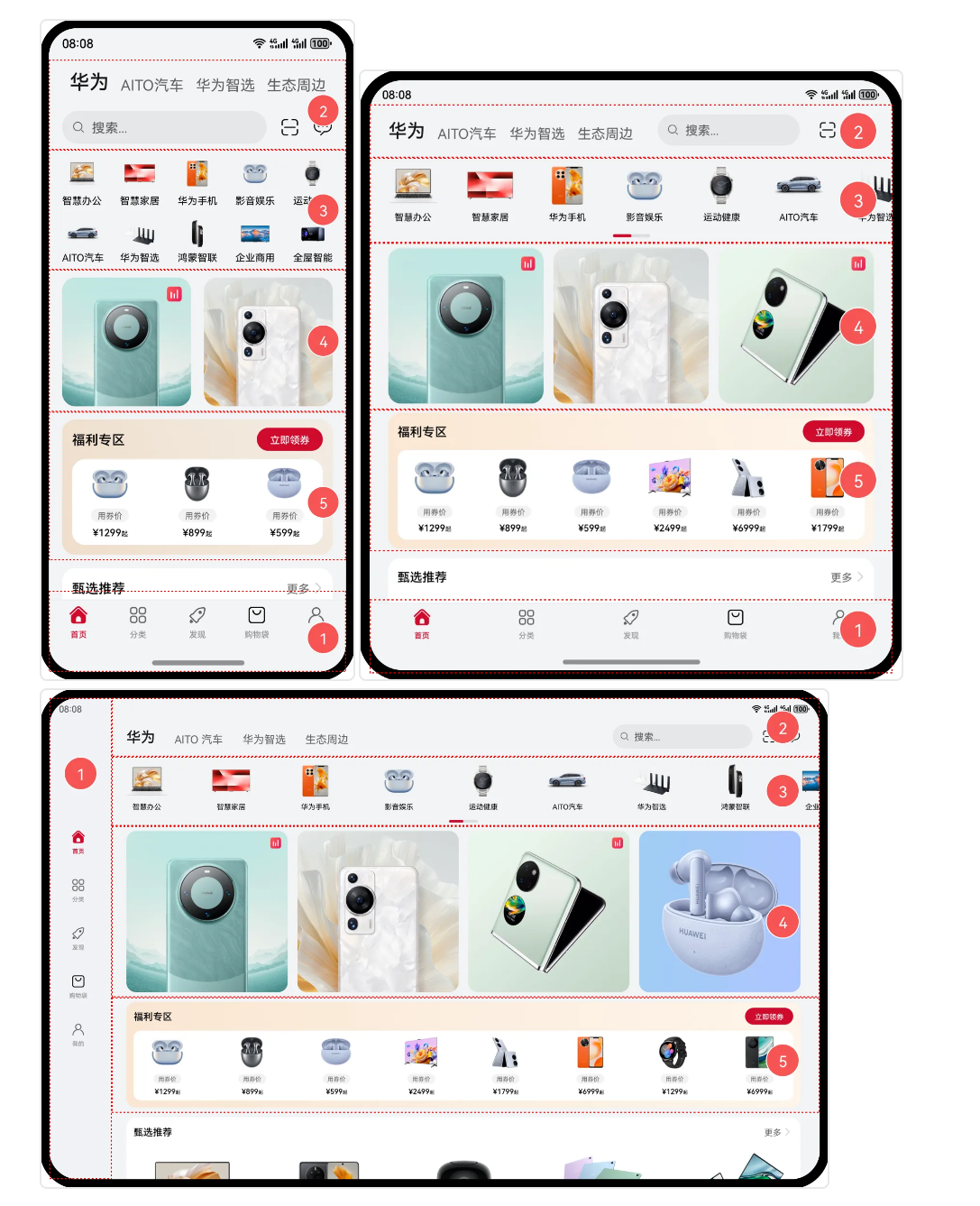
- 自适应布局: 略微调整界面结构 - 第一个图片以及第二个图片,如果界面宽度增大,对应显示商品也会进行适应增加,界面略微进行调整
- **响应式布局:**比较大的界面调整 - 例如第三个平板界面(导航栏移动到左侧 界面进行了较大程度的调整)
2.1、自适应布局
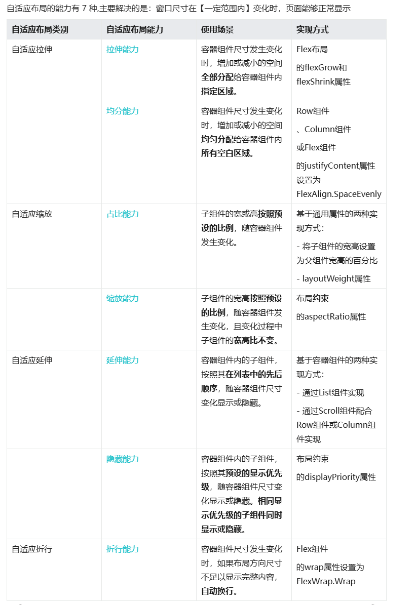
2.1.1、自适应拉伸
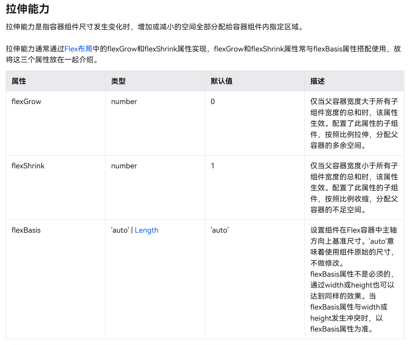
2.1.1.1 拉伸能力(增大or减小区域分配给容器组件)
拉伸能力是指容器组件尺寸发生变化时,增加或减小的空间全部分配给容器组件内指定区域。
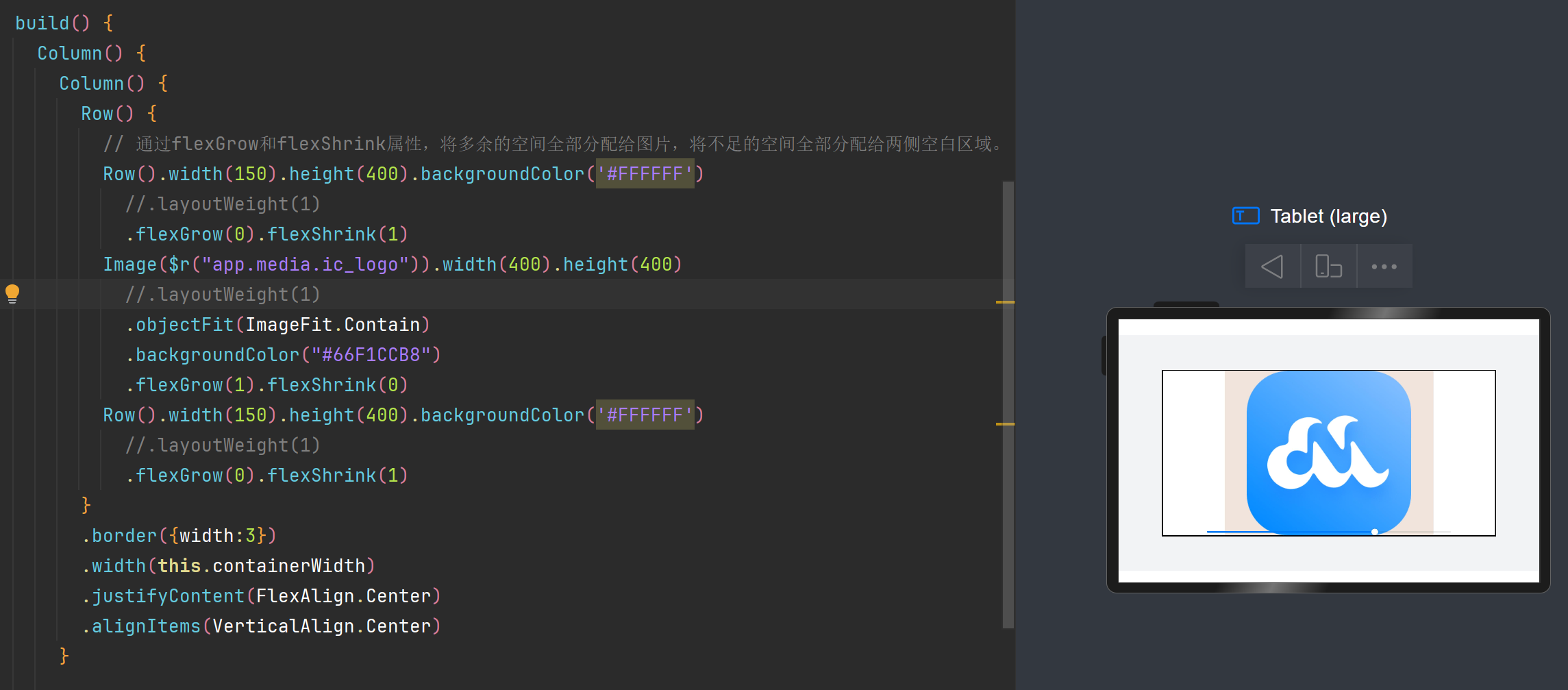
1> flexGrow / flexShrink
该部分重点为了解layoutweight与flenGrow / flexShrink之间的区别
**举一个例子:为Image图片添加layoutweight可以发现确实可以进行容器宽度的匹配,但是视觉效果不佳,**layoutweight会同时对组件进行缩小与放大
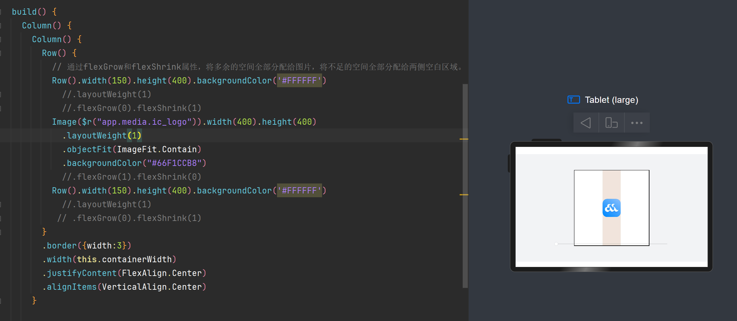
如果想要只在特定情况对组件进行增大或者缩小,就要使用到flexGrow / flexShrink
代码中为Row Image添加该属性,对Row添加.flexGrow(0).flexShrink(1)表示容器只会缩小不会增大
对Image添加.flexGrow(1).flexShrink(0)表示容器只会增大不会缩小
flexShrink/flexGrow
2.1.1.2 均分能力(区域分配给空白)
文字和开关的尺寸固定,仅有中间空白区域(Blank组件)随父容器尺寸变化而伸缩。
均分能力:blank
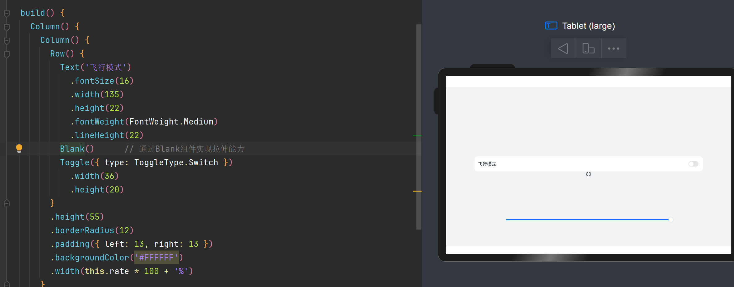
使用blank组件进行中间部分的拉伸
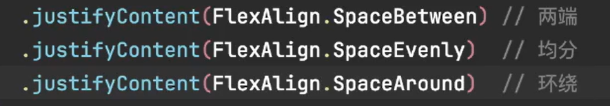
均分能力: justifyContent(FlexAlign.SpaceBetween)属性
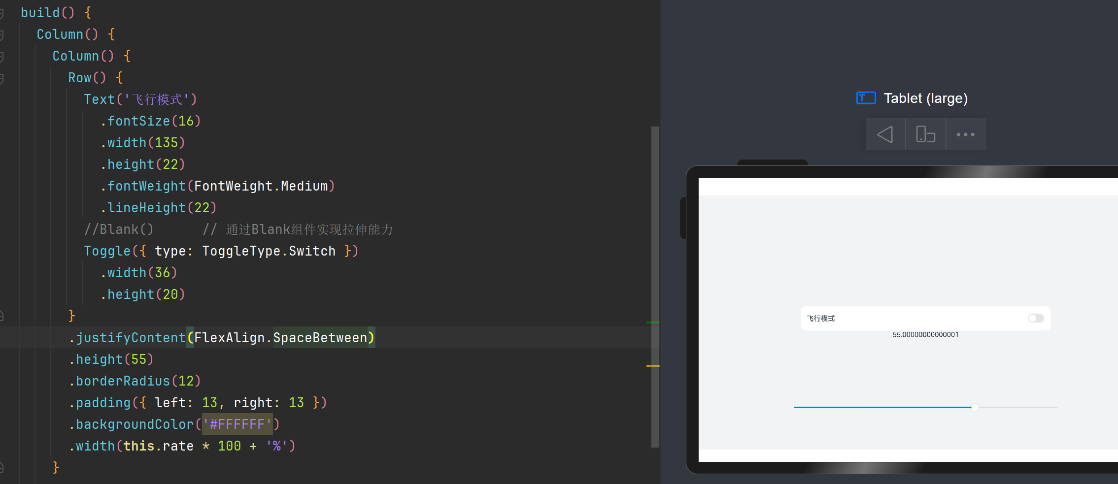
通过设置该属性可以使组件按照父组件尺寸进行适应分布
2.1.2 自适应缩放
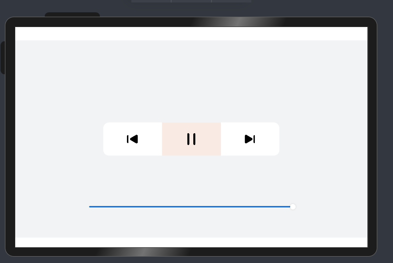
2.1.2.1 占比能力
占比能力是指子组件的宽高按照预设的比例,随父容器组件发生变化。– layoutweight属性
1
2
3
4
5
6
7
8
9
10
11
12
13
14
15
16
17
18
19
20
21
22
23
24
25
26
27
28
29
30
31
32
33
34
35
36
37
38
39
40
41
42
43
44
45
46
47
48
49
50
51
52
53
54
55
56
57
58
59
60
61
62
63
64
65
66
67
68
69
70
71
72
| @Entry
@Component
struct ProportionCapabilitySample {
@State rate: number = 0.5
// 底部滑块,可以通过拖拽滑块改变容器尺寸
@Builder slider() {
Slider({ value: 100, min: 25, max: 50, style: SliderStyle.OutSet })
.blockColor(Color.White)
.width('60%')
.height(50)
.onChange((value: number) => {
this.rate = value / 100
})
.position({ x: '20%', y: '80%' })
}
build() {
Column() {
Column() {
Row() {
Column() {
Image($r("app.media.ic_public_play_last"))
.width(48)
.height(48)
}
.height(96)
.layoutWeight(1) // 设置子组件在父容器主轴方向的布局权重
.justifyContent(FlexAlign.Center)
.alignItems(HorizontalAlign.Center)
Column() {
Image($r("app.media.ic_public_pause"))
.width(48)
.height(48)
}
.height(96)
.layoutWeight(1) // 设置子组件在父容器主轴方向的布局权重
.backgroundColor('#66F1CCB8')
.justifyContent(FlexAlign.Center)
.alignItems(HorizontalAlign.Center)
Column() {
Image($r("app.media.ic_public_play_next"))
.width(48)
.height(48)
}
.height(96)
.layoutWeight(1) // 设置子组件在父容器主轴方向的布局权重
.justifyContent(FlexAlign.Center)
.alignItems(HorizontalAlign.Center)
}
.width(this.rate * 100 + '%')
.height(96)
.borderRadius(16)
.backgroundColor('#FFFFFF')
}
this.slider()
}
.width('100%')
.height('100%')
.backgroundColor('#F1F3F5')
.justifyContent(FlexAlign.Center)
.alignItems(HorizontalAlign.Center)
}
}
|
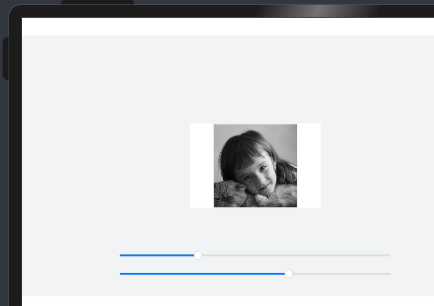
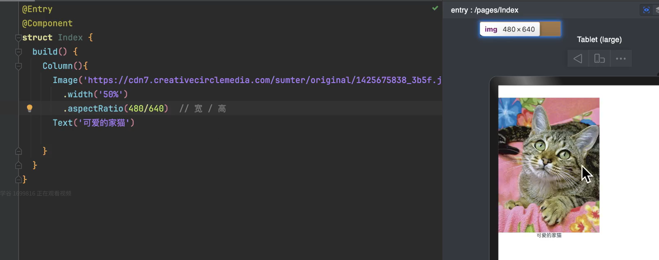
2.1.2.2 缩放能力
缩放能力是指子组件的宽高按照预设的比例,随容器组件发生变化,且变化过程中子组件的宽高比不变。
aspectRatio - 固定图片宽高比
不加该属性组件的宽高比会发生变化
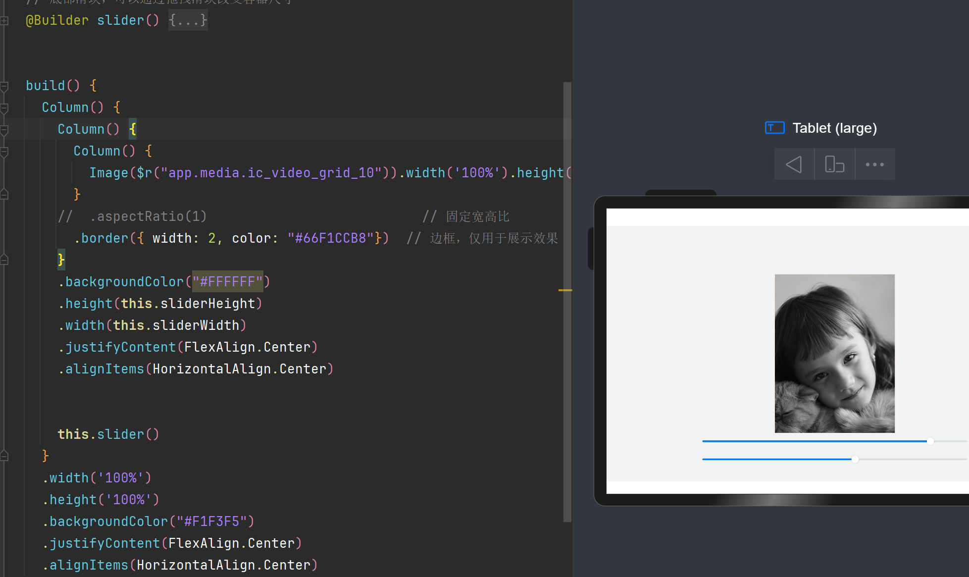
添加aspectRatio()属性 - 图片宽高比固定
注意点:
有的时候会加载网络图片 - 网络速度慢的时候图片会加载不出来(例如下图如果网络图片加载不出来,文字会占据图片的位置) - 此时需要预留出马上要加载出来的图片位置 - aspectRatio即可实现预留图片位置
2.1.3 自适应延伸
2.1.3.1 延伸能力
https://developer.huawei.com/consumer/cn/doc/harmonyos-guides-V5/adaptive-layout-V5#%E5%BB%B6%E4%BC%B8%E8%83%BD%E5%8A%9B
- 延伸能力使用List组件进行实现
1
2
3
4
5
6
7
8
9
10
11
12
13
14
15
16
17
18
19
20
21
22
23
24
25
26
27
28
29
30
31
32
33
34
35
36
37
38
39
40
41
42
43
44
45
46
47
48
49
50
51
52
53
54
55
56
57
58
59
60
61
| @Entry
@Component
struct ExtensionCapabilitySample1 {
@State rate: number = 0.60
readonly appList: number [] = [0, 1, 2, 3, 4, 5, 6, 7]
// 底部滑块,可以通过拖拽滑块改变容器尺寸
@Builder slider() {
Slider({ value: this.rate * 100, min: 8, max: 60, style: SliderStyle.OutSet })
.blockColor(Color.White)
.width('60%')
.height(50)
.onChange((value: number) => {
this.rate = value / 100
})
.position({ x: '20%', y: '80%' })
}
build() {
Column() {
Row({ space: 10 }) {
// 通过List组件实现隐藏能力
List({ space: 10 }) {
ForEach(this.appList, (item:number) => {
ListItem() {
Column() {
Image($r("app.media.startIcon")).width(48).height(48).margin({ top: 8 })
Text('App name')
.width(64)
.height(30)
.lineHeight(15)
.fontSize(12)
.textAlign(TextAlign.Center)
.margin({ top: 8 })
.padding({ bottom: 15 })
}.width(80).height(102)
}.width(80).height(102)
})
}
.padding({ top: 16, left: 10 })
.listDirection(Axis.Horizontal) // list列表的方向
// .lanes(2) // 交叉轴行列数
.width('100%')
.height(118)
.borderRadius(16)
.backgroundColor(Color.White)
}
.width(this.rate * 100 + '%')
this.slider()
}
.width('100%')
.height('100%')
.backgroundColor('#F1F3F5')
.justifyContent(FlexAlign.Center)
.alignItems(HorizontalAlign.Center)
}
}
|
- 通过Scroll以及Row组件进行实现伸缩效果
实现思路: 在Row组件外嵌套一个Scroll容器组件
1
2
3
4
5
6
7
8
9
10
11
12
13
14
15
16
17
18
19
20
21
22
23
24
25
26
27
28
29
30
31
32
33
34
35
36
37
38
39
40
41
42
43
44
45
46
47
48
49
50
51
52
53
54
55
56
| @Entry
@Component
struct ExtensionCapabilitySample2 {
private scroller: Scroller = new Scroller()
@State rate: number = 0.60
@State appList: number [] = [0, 1, 2, 3, 4, 5, 6, 7]
// 底部滑块,可以通过拖拽滑块改变容器尺寸
@Builder slider() {
Slider({ value: this.rate * 100, min: 8, max: 60, style: SliderStyle.OutSet })
.blockColor(Color.White)
.width('60%')
.height(50)
.onChange((value: number) => {
this.rate = value / 100;
})
.position({ x: '20%', y: '80%' })
}
build() {
Column() {
// 通过Scroll和Row组件实现隐藏能力
Scroll(this.scroller) {
Row({ space: 10 }) {
ForEach(this.appList, () => {
Column() {
Image($r("app.media.startIcon")).width(48).height(48).margin({ top: 8 })
Text('App name')
.width(64)
.height(30)
.lineHeight(15)
.fontSize(12)
.textAlign(TextAlign.Center)
.margin({ top: 8 })
.padding({ bottom: 15 })
}.width(80).height(102)
})
}
.padding({ top: 16, left: 10 })
.height(118)
.backgroundColor(Color.White)
}
.scrollable(ScrollDirection.Horizontal)
.borderRadius(16)
.width(this.rate * 100 + '%')
this.slider()
}
.width('100%')
.height('100%')
.backgroundColor('#F1F3F5')
.justifyContent(FlexAlign.Center)
.alignItems(HorizontalAlign.Center)
}
}
|
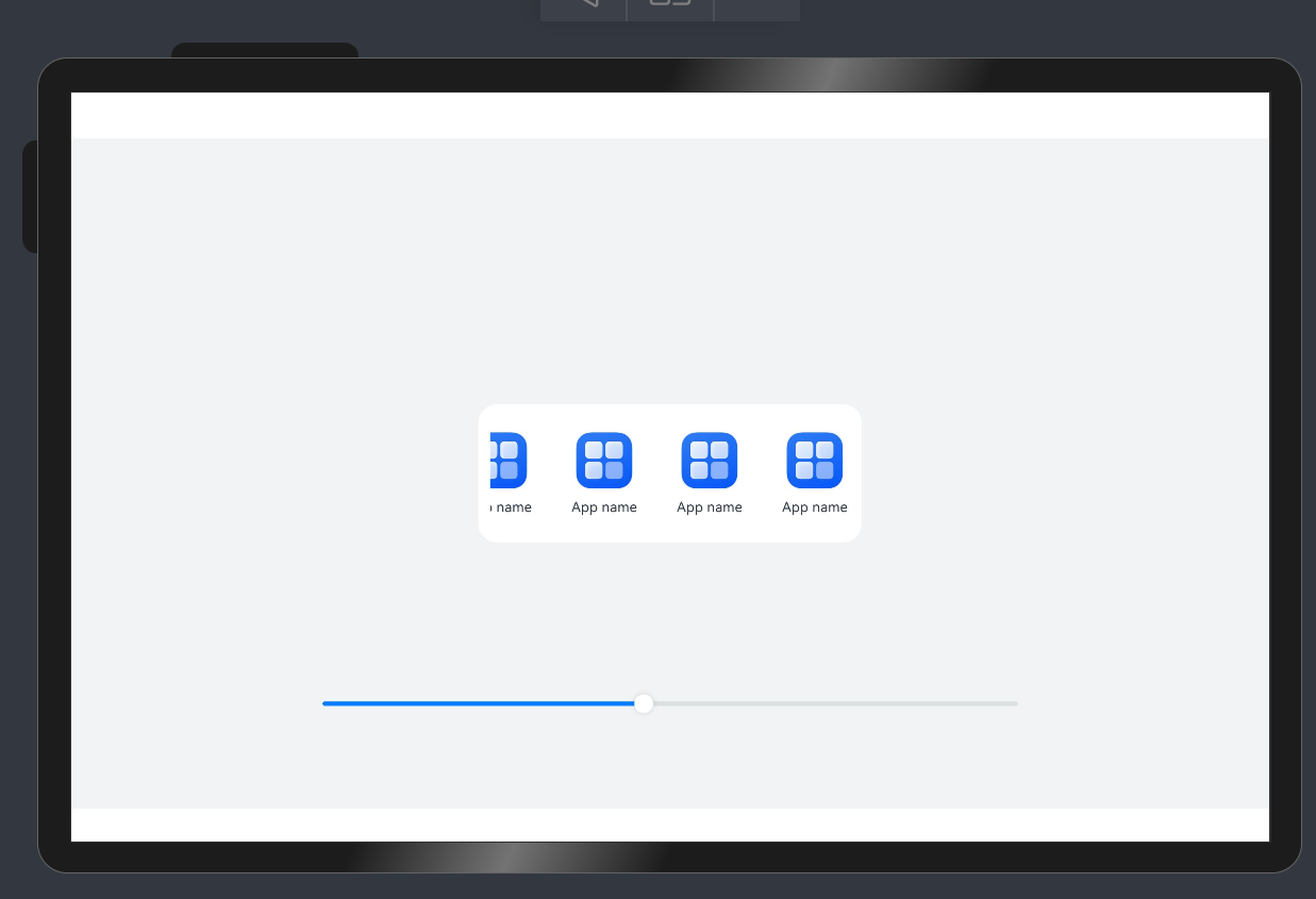
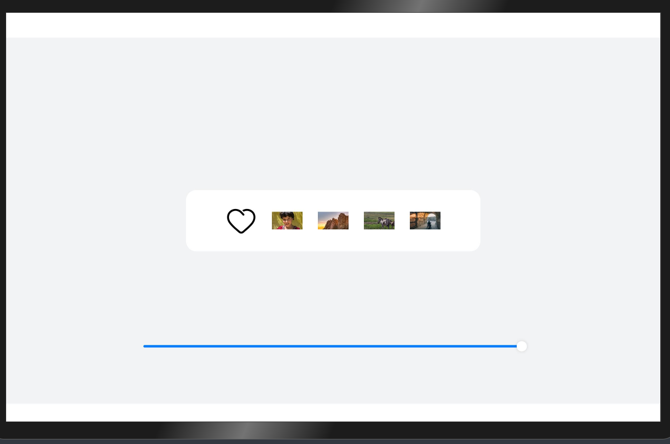
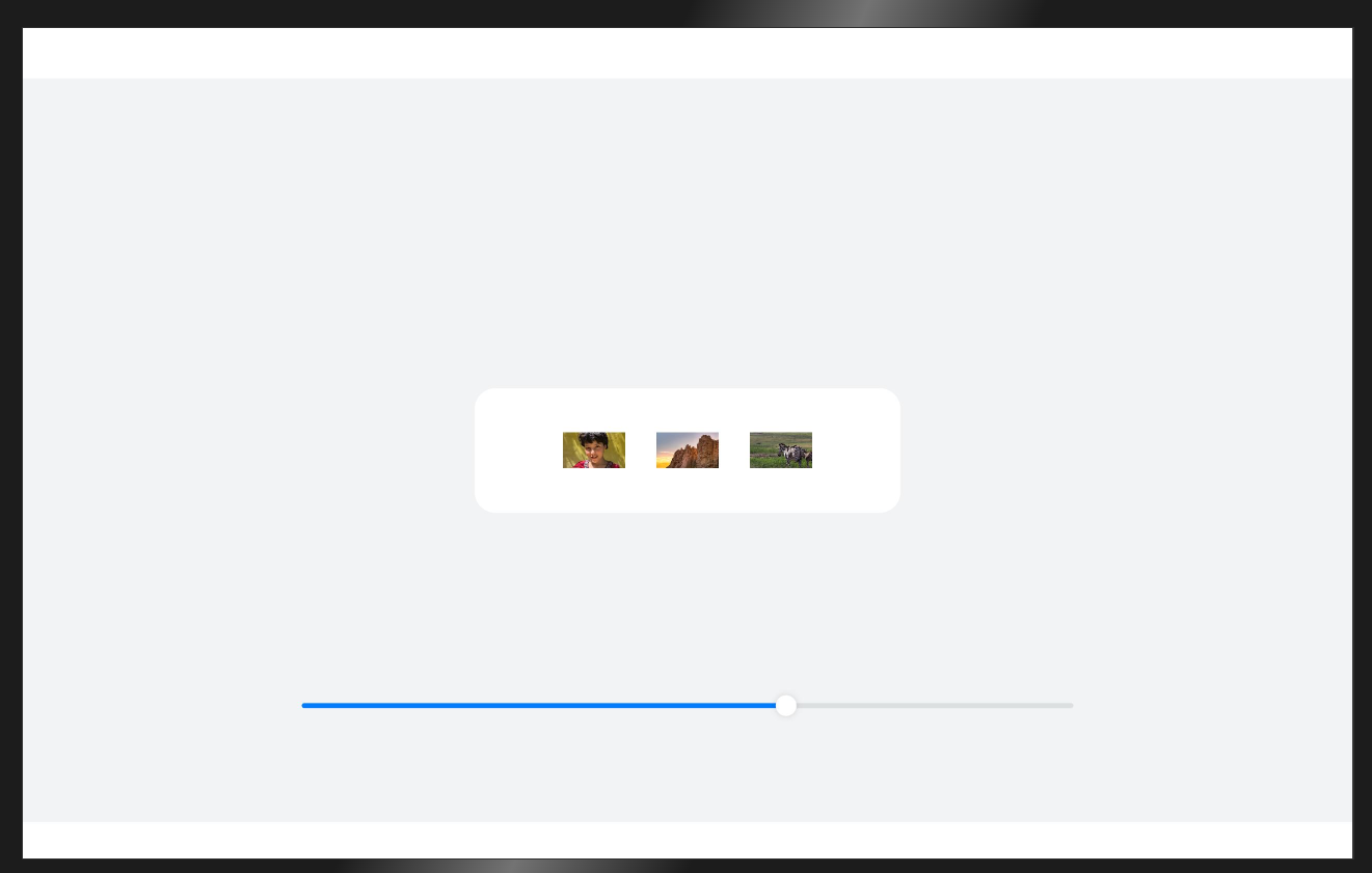
2.1.3.2 隐藏能力
隐藏能力是指容器组件内的子组件,按照其预设的显示优先级,随容器组件尺寸变化显示或隐藏,其中相同显示优先级的子组件同时显示或隐藏。.displayPriority(2) // 布局优先级
1
2
3
4
5
6
7
8
9
10
11
12
13
14
15
16
17
18
19
20
21
22
23
24
25
26
27
28
29
30
31
32
33
34
35
36
37
38
39
40
41
42
43
44
45
46
47
48
49
50
51
52
53
54
55
56
57
58
59
60
61
62
63
64
65
66
67
68
69
70
71
72
73
| @Entry
@Component
struct HiddenCapabilitySample {
@State rate: number = 0.45
// 底部滑块,可以通过拖拽滑块改变容器尺寸
@Builder slider() {
Slider({ value: this.rate * 100, min: 10, max: 45, style: SliderStyle.OutSet })
.blockColor(Color.White)
.width('60%')
.height(50)
.onChange((value: number) => {
this.rate = value / 100
})
.position({ x: '20%', y: '80%' })
}
build() {
Column() {
Row({ space:24 }) {
Image($r("app.media.ic_public_favor"))
.width(48)
.height(48)
.objectFit(ImageFit.Contain)
.displayPriority(1) // 布局优先级
Image($r("app.media.ic_video_grid_9"))
.width(48)
.height(48)
.objectFit(ImageFit.Contain)
.displayPriority(2) // 布局优先级
Image($r("app.media.ic_video_grid_8"))
.width(48)
.height(48)
.objectFit(ImageFit.Contain)
.displayPriority(3) // 布局优先级
Image($r("app.media.ic_video_grid_6"))
.width(48)
.height(48)
.objectFit(ImageFit.Contain)
.displayPriority(2) // 布局优先级
Image($r("app.media.ic_video_grid_3"))
.width(48)
.height(48)
.objectFit(ImageFit.Contain)
.displayPriority(1) // 布局优先级
}
.width(this.rate * 100 + '%')
.height(96)
.borderRadius(16)
.backgroundColor('#FFFFFF')
.justifyContent(FlexAlign.Center)
.alignItems(VerticalAlign.Center)
this.slider()
}
.width('100%')
.height('100%')
.backgroundColor('#F1F3F5')
.justifyContent(FlexAlign.Center)
.alignItems(HorizontalAlign.Center)
}
}
|
实现:
根据代码中设置的优先级,当父容器宽度缩小时会首先隐藏优先级小的组件
注意
设置优先级一般都要进行设置,如果不进行设置会默认为最小级
2.1.4 自适应折行
2.1.4.1 折行能力
Flex组件
1
2
3
4
5
6
7
8
9
10
11
12
13
14
15
16
17
18
19
20
21
22
23
24
25
26
27
28
29
30
31
32
33
34
35
36
37
38
39
40
41
42
43
44
45
46
47
48
49
50
51
52
53
54
55
56
| @Entry
@Component
struct WrapCapabilitySample {
@State rate: number = 0.7
readonly imageList: Resource [] = [
$r('app.media.ic_video_grid_7'),
$r('app.media.ic_video_grid_7'),
$r('app.media.ic_video_grid_7'),
$r('app.media.ic_video_grid_7'),
$r('app.media.ic_video_grid_7'),
$r('app.media.ic_video_grid_7')
]
// 底部滑块,可以通过拖拽滑块改变容器尺寸
@Builder slider() {
Slider({ value: this.rate * 100, min: 50, max: 70, style: SliderStyle.OutSet })
.blockColor(Color.White)
.width('60%')
.onChange((value: number) => {
this.rate = value / 100
})
.position({ x: '20%', y: '87%' })
}
build() {
Flex({ justifyContent: FlexAlign.Center, direction: FlexDirection.Column }) {
Column() {
// 通过Flex组件warp参数实现自适应折行
// TODO 为什么不推荐使用flex进行布局 - 性能不如线性布局(因为需要计算什么时候需要进行换行,多了一个计算的过程)
Flex({
// TODO 需要进行折行的时候用flex组件
direction: FlexDirection.Row, //flex布局方向
alignItems: ItemAlign.Center,
justifyContent: FlexAlign.Center,
wrap: FlexWrap.Wrap //折行能力
}) {
ForEach(this.imageList, (item:Resource) => {
Image(item).width(183).height(138).padding(10)
})
}
.backgroundColor('#FFFFFF')
.padding(20)
.width(this.rate * 100 + '%')
.borderRadius(16)
}
.width('100%')
this.slider()
}.width('100%')
.height('100%')
.backgroundColor('#F1F3F5')
}
}
|
tips
为什么不推荐使用flex进行布局 - 性能不如线性布局(因为需要计算什么时候需要进行换行,多了一个计算的过程)
2.2 响应式布局
比较大的界面调整
自适应布局可以保证窗口尺寸在【一定范围内变化】时,页面的显示是正常的。但是将窗口尺寸【变化较大】时(如窗口宽度从400vp变化为1000vp),仅仅依靠自适应布局可能出现图片异常放大或页面内容稀疏、留白过多等问题,此时就需要借助响应式布局能力调整页面结构。
响应式布局是指页面内的元素可以根据特定的特征(如窗口宽度、屏幕方向等)自动变化以适应外部容器变化的布局能力。
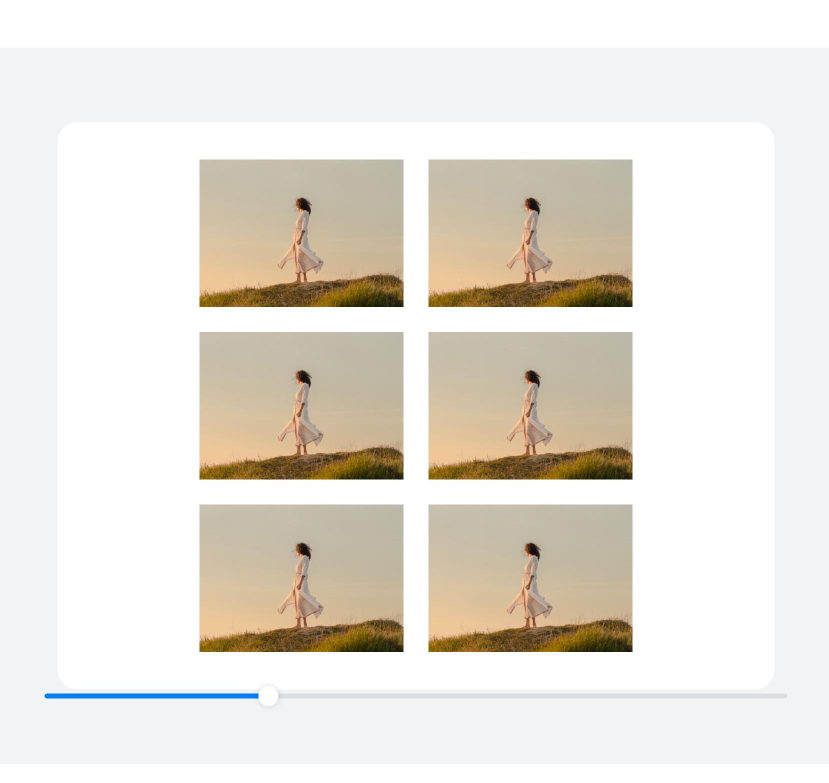
第一种是网格布局:网格布局可以有效的控制需要排版的行和列数,也可设置行列之间的间距
第二种栅格布局:栅格布局相比于网格布局功能更加强大
基础写法:https://developer.huawei.com/consumer/cn/doc/harmonyos-references-V5/ts-container-gridrow-V5#gutteroption
网格布局 Grid(网格布局容器) - GridItem(网格布局项)
栅格布局 GridRow(栅格布局容器) - GridCol(栅格布局项)
对比:
1.GridRow 设行列数和间距更简单
2.GridRow 支执点,响应式布局
3.GridCol 支持元素排序,所占列数
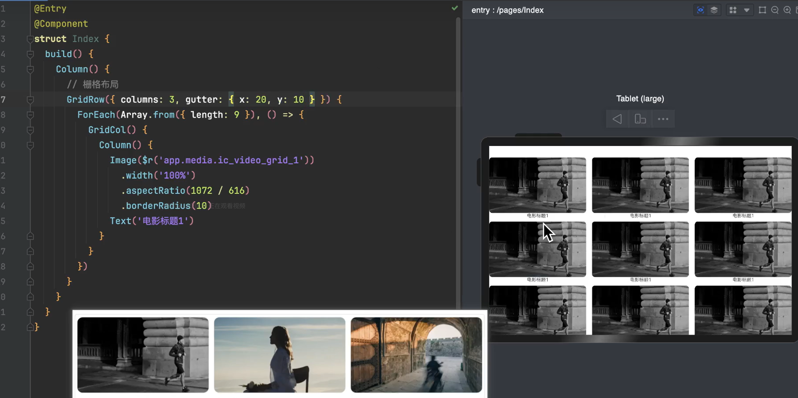
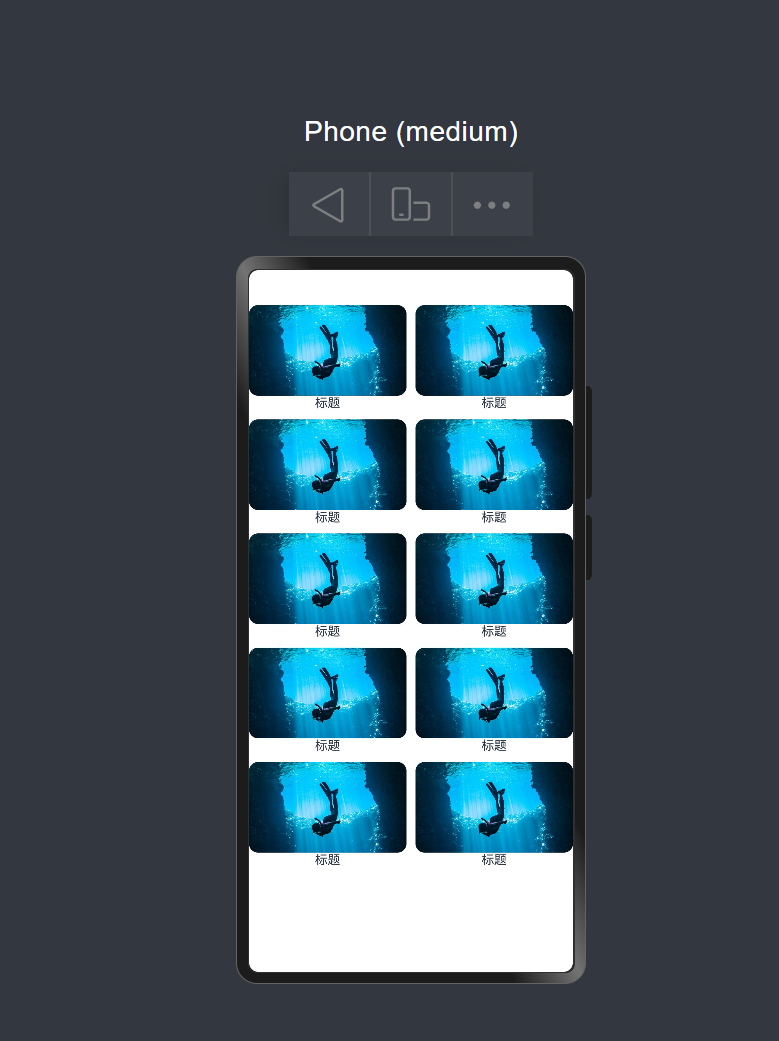
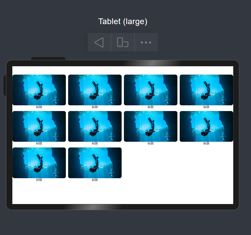
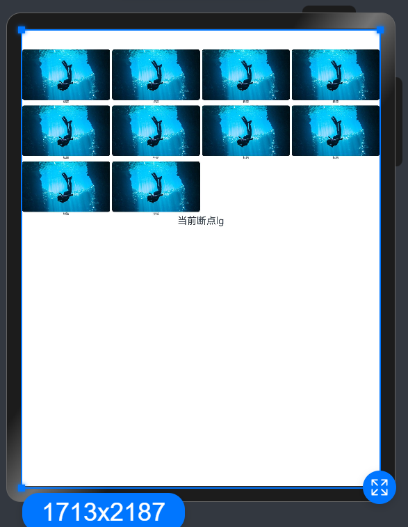
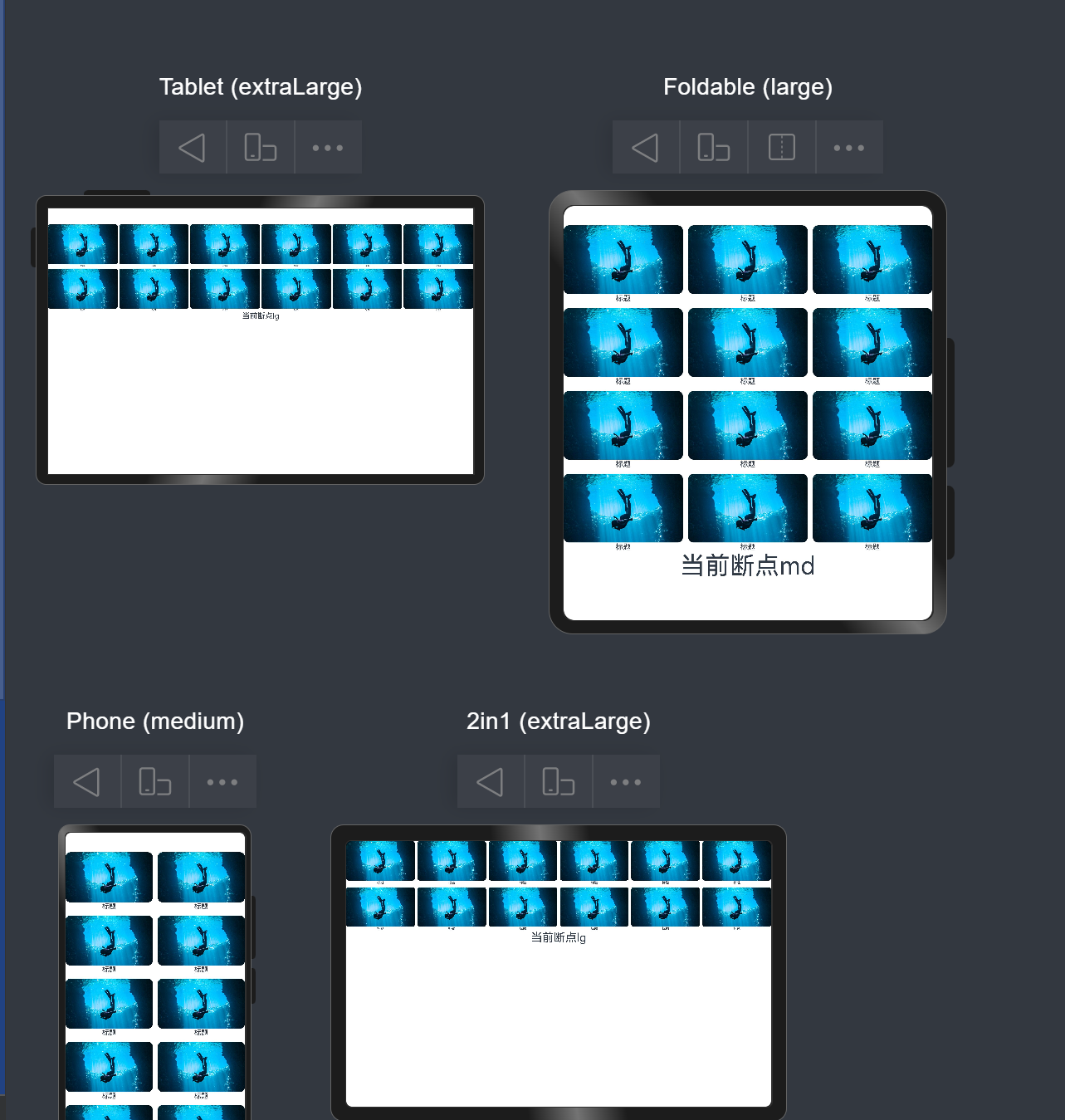
2.2.1栅格布局(GridRow/GridCol)
设置断点(sm md lg)
GridRowColumnOption
栅格在不同宽度设备类型下,栅格列数。
卡片能力: 从API version 9开始,该接口支持在ArkTS卡片中使用。
元服务API: 从API version 11开始,该接口支持在元服务中使用。
系统能力: SystemCapability.ArkUI.ArkUI.Full
| 名称 |
类型 |
必填 |
说明 |
| xs |
number |
否 |
在栅格大小为xs的设备上,栅格容器组件的栅格列数。 |
| sm |
number |
否 |
在栅格大小为sm的设备上,栅格容器组件的栅格列数。 |
| md |
number |
否 |
在栅格大小为md的设备上,栅格容器组件的栅格列数。 |
| lg |
number |
否 |
在栅格大小为lg的设备上,栅格容器组件的栅格列数。 |
| xl |
number |
否 |
在栅格大小为xl的设备上,栅格容器组件的栅格列数。 |
| xxl |
number |
否 |
在栅格大小为xxl的设备上,栅格容器组件的栅格列数。 |
1
2
3
4
5
6
7
8
9
10
11
12
13
14
15
16
17
18
19
20
21
22
23
24
25
26
| @Entry
@Component
struct Index {
build() {
Column() {
// 栅格布局 - columns的对应属性
// sm为当当前的设备为小型设备的时候(例如手机):有2列
// md为当当前的设备为中型设备的时候(例如折叠屏):有3列
// lg为当当前的设备为大型设备的时候(例如平板):有4列
GridRow({ columns: { sm: 2, md: 3, lg: 4 }, gutter: { x: 10, y: 10 } }) {
ForEach(Array.from({ length: 10 }), () => {
GridCol() {
Column() {
Image($r('app.media.ic_video_grid_5'))
.width('100%')
.aspectRatio(1072 / 616)
.borderRadius(10)
Text('标题')
.fontSize(14)
}
}
})
}
}
}
}
|
监听断点变化
https://developer.huawei.com/consumer/cn/doc/harmonyos-references/ts-container-gridrow#onbreakpointchange
1
2
3
| .onBreakpointChange((breakpoints: string) => {
this.breakpoints = breakpoints
})
|
控制子元素所占列数
通过span控制所占列数
1
2
3
4
5
6
7
8
9
10
11
12
13
14
15
16
17
18
19
20
21
22
23
24
25
26
27
28
29
30
31
32
33
34
35
36
37
38
39
40
41
42
43
44
| @Entry
@Component
struct Index {
@State breakpoints: string = ''
build() {
Column() {
// 栅格布局 - columns的对应属性
// sm为当当前的设备为小型设备的时候(例如手机):有2列
// md为当当前的设备为中型设备的时候(例如折叠屏):有3列
// lg为当当前的设备为大型设备的时候(例如平板):有4列
GridRow({
columns: 12,
gutter: 10
}) {
ForEach(Array.from({ length: 12 }), () => {
// 栅格布局 通过span控制所占列数
GridCol({
span: {
sm: 6,
md: 4,
lg: 2
}
}) {
Column() {
Image($r('app.media.ic_video_grid_5'))
.width('100%')
.aspectRatio(1072 / 616)
.borderRadius(10)
Text('标题')
.fontSize(14)
}
}
})
}
.onBreakpointChange((breakpoints: string) => {
  this.breakpoints = breakpoints
})
Text('当前断点' + this.breakpoints)
.fontSize(46)
}
}
}
|
2.2.2 断点
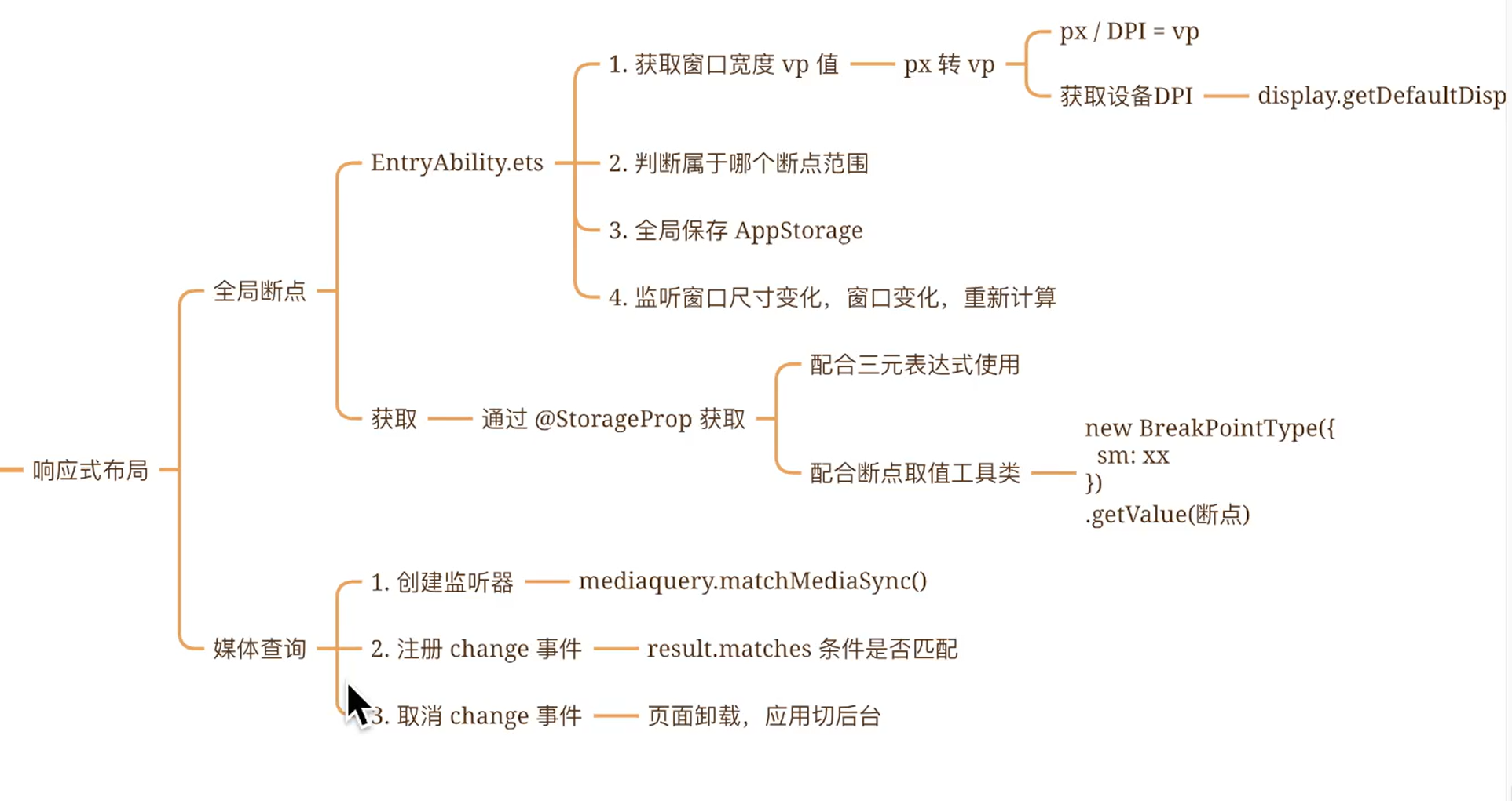
2.2.2.1 全局断点
https://developer.huawei.com/consumer/cn/doc/harmonyos-guides/responsive-layout
核心三步走:
1
2
3
4
5
6
7
8
9
10
11
12
13
14
15
16
17
18
19
20
21
22
23
24
25
26
27
28
29
30
31
32
33
34
35
36
37
38
39
40
41
42
43
44
45
46
47
| // MainAbility.ts
import { window, display } from '@kit.ArkUI'
import { UIAbility } from '@kit.AbilityKit'
export default class MainAbility extends UIAbility {
private curBp: string = ''
//...
// 根据当前窗口尺寸更新断点
private updateBreakpoint(windowWidth: number) :void{
try {
// 核心代码1: 将长度的单位由px换算为vp,(px除以像素密度得到vp)
let windowWidthVp = windowWidth / display.getDefaultDisplaySync().densityPixels
let newBp: string = ''
// 核心代码2: 基于窗口宽度vp值,判断当前设备属于哪个断点范围
if (windowWidthVp < 320) {
newBp = 'xs'
} else if (windowWidthVp < 600) {
newBp = 'sm'
} else if (windowWidthVp < 840) {
newBp = 'md'
} else {
newBp = 'lg'
}
if (this.curBp !== newBp) {
this.curBp = newBp
// 核心代码3: 使用状态变量记录当前断点值
AppStorage.setOrCreate('currentBreakpoint', this.curBp)
}
} catch(err) {
console.log("getDisplayByIdSync failed err" + err.code)
}
}
onWindowStageCreate(windowStage: window.WindowStage) :void{
windowStage.getMainWindow().then((windowObj) => {
// 获取应用启动时的窗口尺寸
this.updateBreakpoint(windowObj.getWindowProperties().windowRect.width)
// 注册回调函数,监听窗口尺寸变化
windowObj.on('windowSizeChange', (windowSize)=>{
this.updateBreakpoint(windowSize.width)
})
});
// ...
}
//...
}
|
- 页面中使用断点信息
1
2
3
4
| @Entry
@Component
struct Demo11_login {
@StorageProp('currentBreakpoint') curBp: string = 'sm'
|
2.2.2.2 封装系统工具-BreakPointType
封装系统工具-BreakPointType
* 1. 如果是 两种的情况:用 三元表达式 即可
2. 如果是 多种的情况:用 三元表达式 就不太方便啦
1
2
3
4
5
6
7
8
9
10
11
12
13
14
15
16
17
18
19
20
21
22
23
24
25
26
27
28
29
30
31
32
33
34
35
| // common/breakpointSystem.ets
/*
封装系统工具-BreakPointType
* 1. 如果是 两种的情况:用 三元表达式 即可
2. 如果是 多种的情况:用 三元表达式 就不太方便啦
*/
export interface BreakPointTypeOption<T> {
xs?: T
sm?: T
md?: T
lg?: T
}
export class BreakPointType<T> {
options: BreakPointTypeOption<T>
constructor(option: BreakPointTypeOption<T>) {
this.options = option
}
getValue(currentBreakPoint: string) {
if (currentBreakPoint === 'xs') {
return this.options.xs
} else if (currentBreakPoint === 'sm') {
return this.options.sm
} else if (currentBreakPoint === 'md') {
return this.options.md
} else if (currentBreakPoint === 'lg') {
return this.options.lg
} else {
return undefined
}
}
}
|
1
2
3
4
5
6
7
8
9
10
11
12
13
14
15
16
17
18
19
20
21
22
23
24
25
26
27
| // 1. 导入BreakPointType
import { BreakPointType } from '../commons/breakpointSystem'
@Entry
@Component
struct Index {
// 2. 通过 AppStorage 获取断点值
@StorageProp('currentBreakpoint') currentBreakpoint: string = 'sm'
build() {
Column() {
Text(this.currentBreakpoint)
}
.width(200)
.height(200)
.backgroundColor(
// 3. 实例化 设置不同断点的取值,并通过 getValue 根据当前断点值对应的值
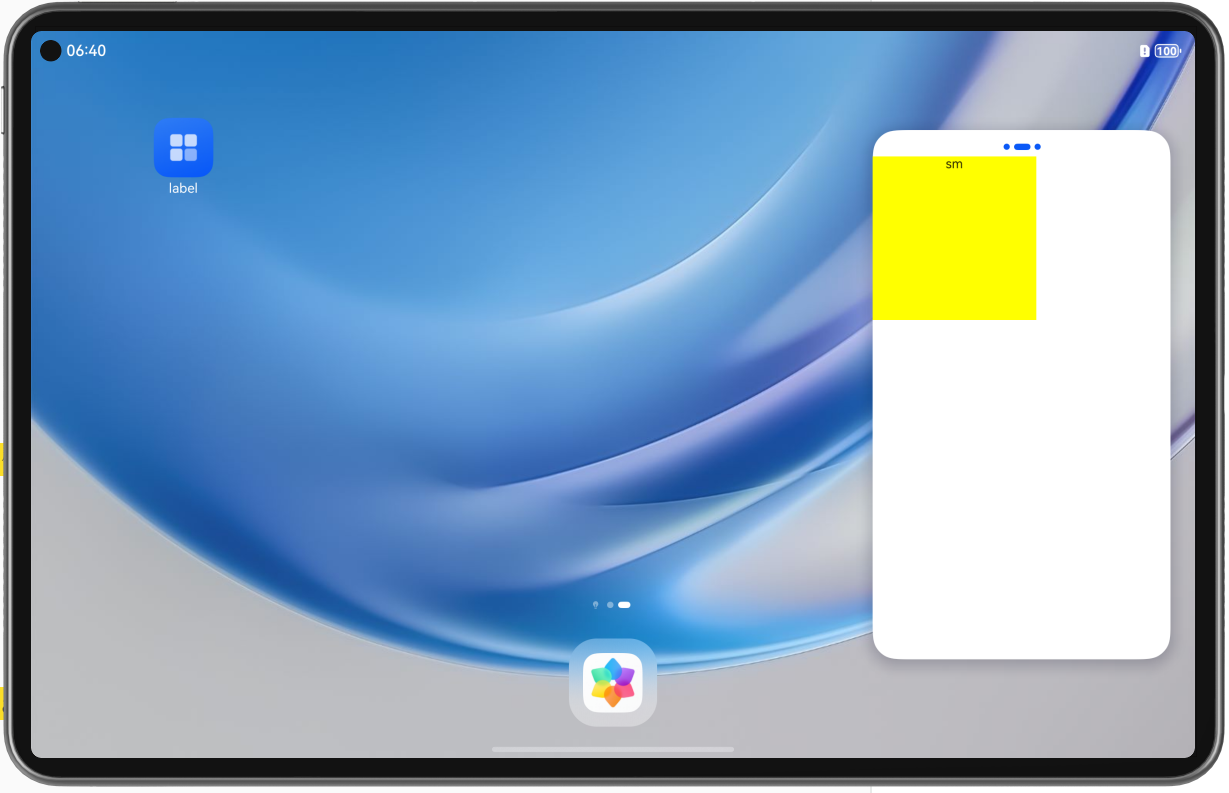
new BreakPointType({
xs: Color.Red,
sm: Color.Yellow,
md: Color.Blue,
lg: Color.Green
}).getValue(this.currentBreakpoint)
)
}
}
|
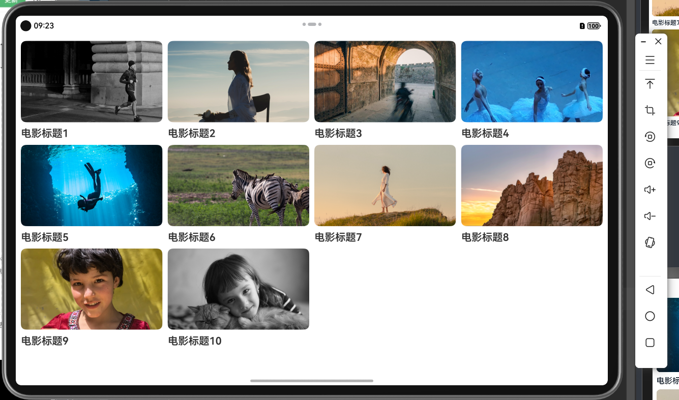
案例说明:
运用了上面封装的工具类进行多种设备的界面适配(例如sm型号为两列 md/lg型号为4列)
1
2
3
4
5
6
7
8
9
10
11
12
13
14
15
16
17
18
19
20
21
22
23
24
25
26
27
28
29
30
31
32
33
34
35
36
37
38
39
40
41
42
43
44
45
46
47
48
49
50
51
52
| import { BreakPointType } from '../commons/breakpointSystem'
interface MovieItem {
title: string
img: ResourceStr
}
@Entry
@Component
struct Index {
items: MovieItem[] = [
{ title: '电影标题1', img: $r('app.media.ic_video_grid_1') },
{ title: '电影标题2', img: $r('app.media.ic_video_grid_2') },
{ title: '电影标题3', img: $r('app.media.ic_video_grid_3') },
{ title: '电影标题4', img: $r('app.media.ic_video_grid_4') },
{ title: '电影标题5', img: $r('app.media.ic_video_grid_5') },
{ title: '电影标题6', img: $r('app.media.ic_video_grid_6') },
{ title: '电影标题7', img: $r('app.media.ic_video_grid_7') },
{ title: '电影标题8', img: $r('app.media.ic_video_grid_8') },
{ title: '电影标题9', img: $r('app.media.ic_video_grid_9') },
{ title: '电影标题10', img: $r('app.media.ic_video_grid_10') },
]
@StorageProp('currentBreakpoint') currentBreakpoint: string = 'sm'
build() {
Grid() {
ForEach(this.items, (item: MovieItem) => {
GridItem() {
Column({ space: 10 }) {
Image(item.img)
.borderRadius(10)
Text(item.title)
.width('100%')
.fontSize(20)
.fontWeight(600)
}
}
})
}
.columnsTemplate(new BreakPointType({
xs: '1fr 1fr',
sm: '1fr 1fr',
md: '1fr 1fr 1fr',
lg: '1fr 1fr 1fr 1fr'
}).getValue(this.currentBreakpoint)
)
.rowsGap(10)
.columnsGap(10)
.padding(10)
}
}
|
2.2.3 媒体查询
https://developer.huawei.com/consumer/cn/doc/harmonyos-guides-V5/arkts-layout-development-media-query-V5
核心步骤:创建监听器 - 添加回调函数(当result中的matches值为true时表示匹配成功)此时可以进行变量的赋值操作
1
2
3
4
5
6
7
8
9
10
11
12
13
14
15
16
17
18
19
20
21
22
23
| // 媒体查询
import { mediaquery } from '@kit.ArkUI'
// 1. 创建监听器
const listenerXS: mediaquery.MediaQueryListener = mediaquery.matchMediaSync('(0vp<=width<320vp)');
@Entry
@Component
struct Index {
// 注册监听器
aboutToAppear(): void {
// 添加回调函数
listenerXS.on('change', (result: mediaquery.MediaQueryResult) => {
console.log('listenerXS result:', JSON.stringify(result))
})
}
build() {
Column() {
Text('hello world')
}
}
}
|
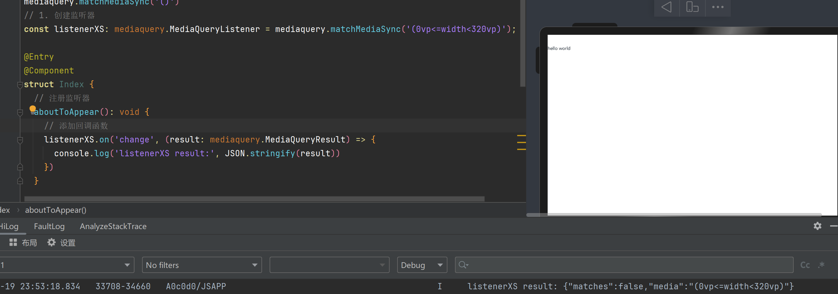
listenerXS result: {“matches”:false,”media”:”(0vp<=width<320vp)”}
说明:match进行匹配 - 判断是否符合监听器括号中的条件(因为开的是平板所以输出为false)
media为输出监听器的条件
为了提高性能,在界面被销毁时应该移除监听器
1
2
3
4
5
6
7
| aboutToDisappear(): void {
// 移除监听器
listenerXS.off('change')
listenerSM.off('change')
listenerMD.off('change')
listenerLG.off('change')
}
|
2.2.4 总结概括
三、功能级一多
不同设备的系统能力有差异,如智能穿戴设备是否具备定位能力、智慧屏是否具备摄像头等,功能如何兼容。
什么是系统能力
系统能力(即SystemCapability,缩写为SysCap)指操作系统中每一个相对独立的特性,如蓝牙,WIFI,NFC,摄像头等,都是系统能力之一。每个系统能力对应多个API,随着目标设备是否支持该系统能力共同存在或消失。
3.1 canIUse判断
1
2
3
4
5
6
| if (canIUse("能力集的名字")) {
// 正常调用
} else {
// 提示用户
console.log("该设备不支持SystemCapability.Communication.NFC.Core")
}
|
eg1:判断是否具有NFC系统功能
1
2
3
4
5
6
7
8
9
10
11
12
| // 如果某个系统能力没有写入应用的要求能力集中,那么在使用前需要判断设备是否支持该系统能力。
aboutToAppear(): void {
// 方法1:使用canUse接口判断设备是否支持某系统能力
// TODO if (canIUse("能力集的名字"))
if (canIUse("SystemCapability.Communication.NFC.Core")) {
console.log("该设备支持SystemCapability.Communication.NFC.Core");
} else {
console.log("该设备不支持SystemCapability.Communication.NFC.Core");
}
}
|
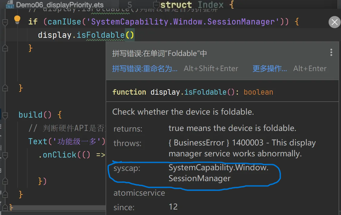
eg2:display.isFoldable() 这个 api 并不是每个设备都可以使用,在调用之前就可以先判断一下
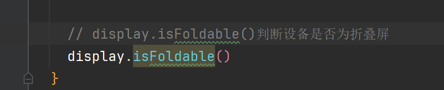
isFoldable不是所有设备都可以 - 所以会显示高亮效果
调用canIUse接口判断是否具有该系统功能,可以将鼠标移动至isFoldable处查看如何在canIUse中写系统功能
1
2
3
4
| // display.isFoldable()判断设备是否为折叠屏
if (canIUse('SystemCapability.Window.SessionManager')) {
display.isFoldable()
}
|
四、工程级一多
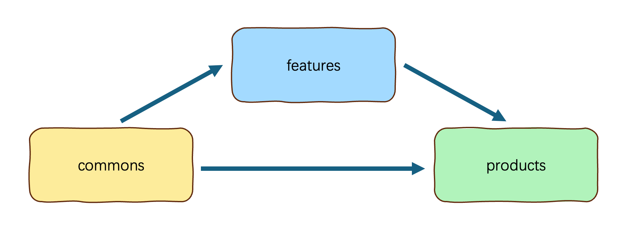
4.1 概念
一多模式下,官方推荐在开发过程中采用”三层工程架构”,其实就是把项目拆分成不同类型的模块,再通过模块之间的引用组合,最终实现应用功能,拆分规范如下:
4.2 选择合适的包类型
HAP、HAR、HSP三者的功能和使用场景总结对比如下:
| Module类型 |
包类型 |
说明 |
| Ability |
HAP |
应用的功能模块,可以独立安装和运行,必须包含一个entry类型的HAP,可选包含一个或多个feature类型的HAP。 |
| Static Library |
HAR |
静态共享包,编译态复用。- 支持应用内共享,也可以发布后供其他应用使用。- 作为二方库,发布到OHPM私仓,供公司内部其他应用使用。- 作为三方库,发布到OHPM中心仓,供其他应用使用。- 多包(HAP/HSP)引用相同的HAR时,会造成多包间代码和资源的重复拷贝,从而导致应用包膨大。- 注意:编译HAR时,建议开启混淆能力,保护代码资产。 |
| Shared Library |
HSP |
动态共享包,运行时复用。- 当前仅支持应用内共享。- 当多包(HAP/HSP)同时引用同一个共享包时,采用HSP替代HAR,可以避免HAR造成的多包间代码和资源的重复拷贝,从而减小应用包大小。 |
1> HAP:应用的功能模块,可以独立安装和使用(必须包含一个entry + 可选一个或者多个feature)
2> HAR:静态共享包,编译时复用(应用内共享,可发布后供其他应用使用)(三方库,公司私仓)
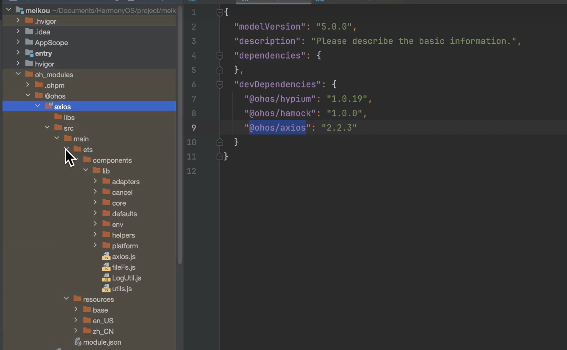
tip:如果远程仓库下载不下来可以直接在该文件中进行配置:
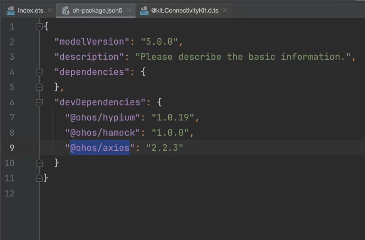
配置完毕即可查看下载下来的包:
注意:多包(HAP/HSP)引用相同的HAR时,会造成多包间代码和资源的重复拷贝,从而导致应用包膨大。
建议下载到commons模块,因为features和products都可以进行调用(如果下载到products模块只能在products进行使用,commons或者features模块想要进行使用还需要重新进行下载,导致代码冗余)